CoolCrate
-
As a team lead designer with experience in case studies, I created the guideline for our project’s timeline as well as provided resources for the user personas, competitive analysis, user research survey, styling guidelines, and the process for prototyping/user testing. These resources included links to past projects I’ve done and templates. I also organized weekly meetings for feedback sessions and updates on our individually assigned work.
-
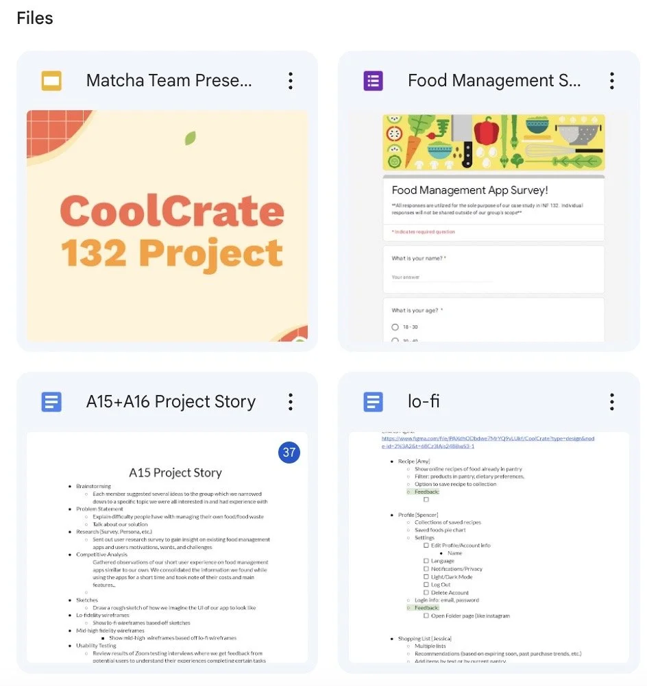
This was a quarter long project assigned by Dr. Stacy Branham in Informatics 132.
-
I wanted to keep refining my knowledge with Figma and these tools were the most commonly used amongst our group.
The Context
In my Informatics 132 course, my group and I were tasked with creating a quarter-long case study up to our personal choice. We each suggested several category ideas, and eventually came to the conclusion to create an app surrounding the issue of food waste management.
The Problem
Our guiding question was: ‘How might we provide a comprehensive way for users to keep track of food in their fridges?’ We wanted to explore solutions to this problem with additional features such as: an option to customize labels for food in shared households, view recipes based on users’ pantry, and the ability to create shopping lists.
The Solution
Thus, CoolCrate was born. Scroll down below to see how we got here ⬇️
User Research
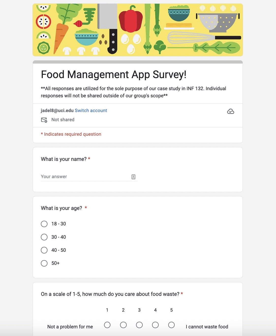
Before we dove into the fun part, it was imperative to understand our target demographic. To do this, I created a user research survey to get a better understanding of what users have experienced with food waste management, as well as gain insight on what improvements can be made on existing apps. I then tasked each of my group members and I to send the survey out and obtain at least 5 responses each.
Our target demographic were users ages 18-30 who made up 91.3% of our survey respondents. From our results, we found that over 56% of respondents value food waste and struggled to keep proper track of their food products’ lifespan.
We also collected insight on what features user’s would like to see in future food waste apps and narrowed down our apps features to address these unique challenges:
the ability to customize name labels for products
the option to choose which reminders (use by, expiring, time span specific) users would like to view
easily accessible features to input products into one’s household log with a barcode scanner
suggested recipes for expiring foods
the ability to manage multiple households & shopping lists
User Personas
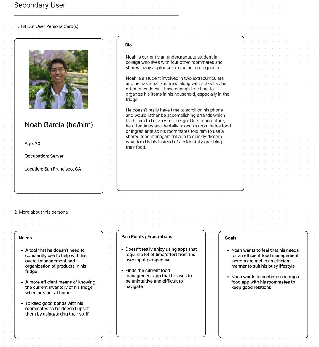
From our user research, I provided my group members with templates for our user personas as no one had much experience with creating personas. Three of us created primary users while another group member and I created secondary users. My user was Noah Garcia (he/him), who struggles with being an on-the-go college student with needs of:
A tool that he doesn’t need to manage daily to help with his overall management and organization of products in his fridge
A more efficient means of knowing the current inventory of his fridge when he’s not at home
To keep good bonds with his roommates so he doesn’t upset them by using/taking their stuff without knowing what products belong to who
To address his needs, we further solidified our proposed features of a collaborative fridge option, customized food labels, and an easy access user interface.
Competitive Analysis
After spending time understanding our users, I tasked each member of our group to download several competitor apps that our survey responders suggested as well as apps we found on the internet that are alternatives to our solution. I downloaded CookList and spent about half of a week to navigate its features and overall find elements that I liked and disliked about the app.
From my findings, CookList seemed to have the basic features of a shopping list, expiration reminders, and options for both manual/suggested products to add to one’s inventory. However, it lacked features of customized labels for products, receipt scanning, and the ability to keep track of food in more than one fridge. I then compiled my app’s findings alongside my group members’ findings into a competitive analysis chart so we could solidify what makes our app unique against our competitors.
Sketches
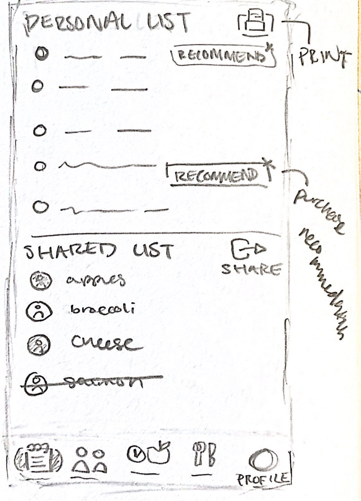
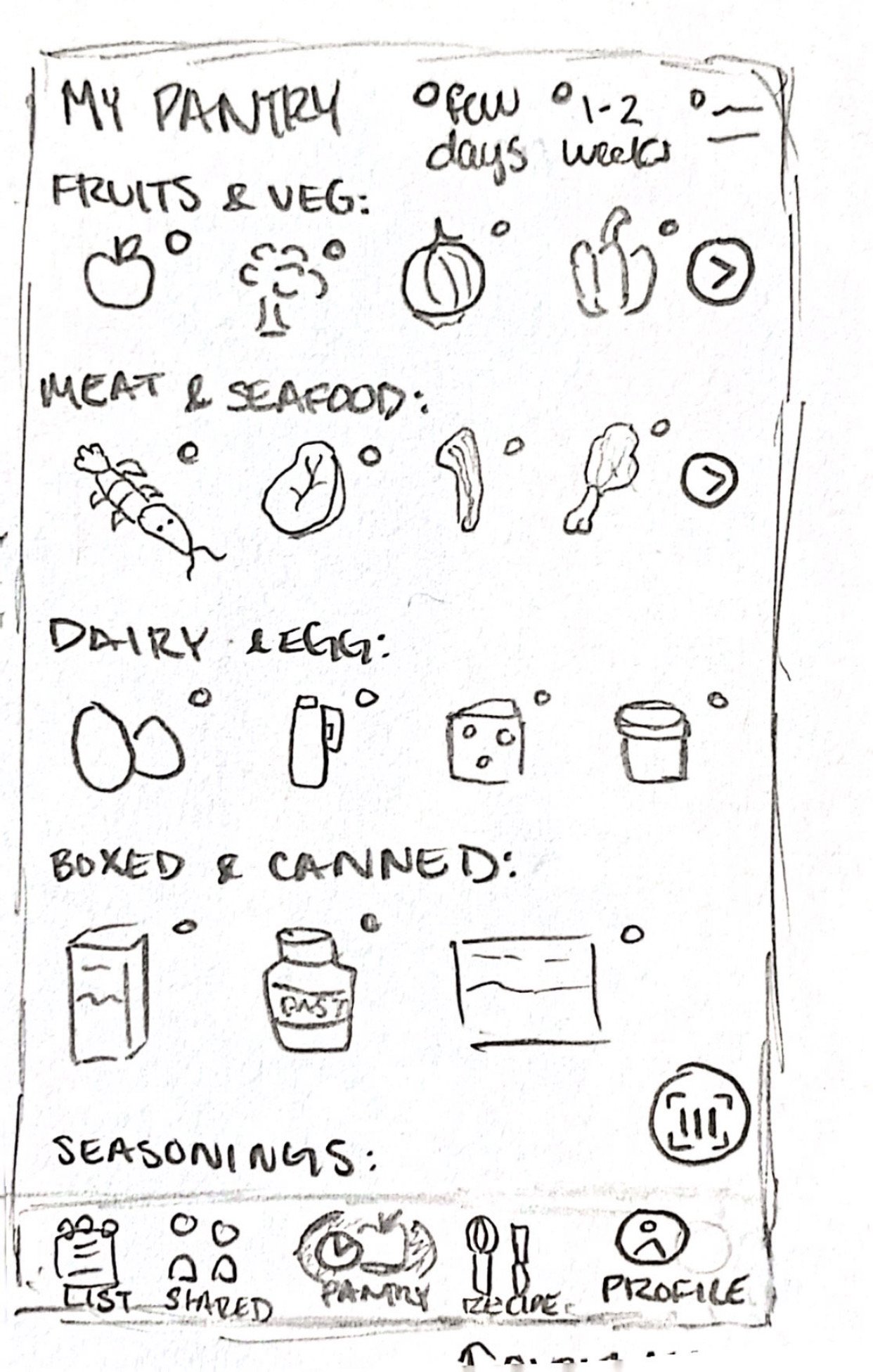
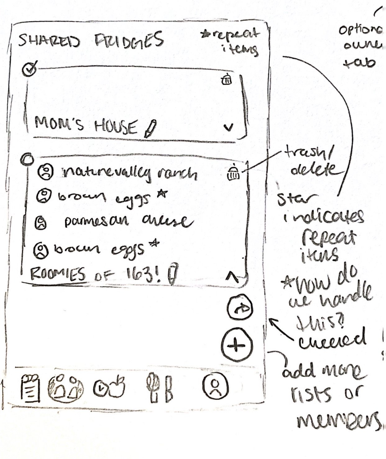
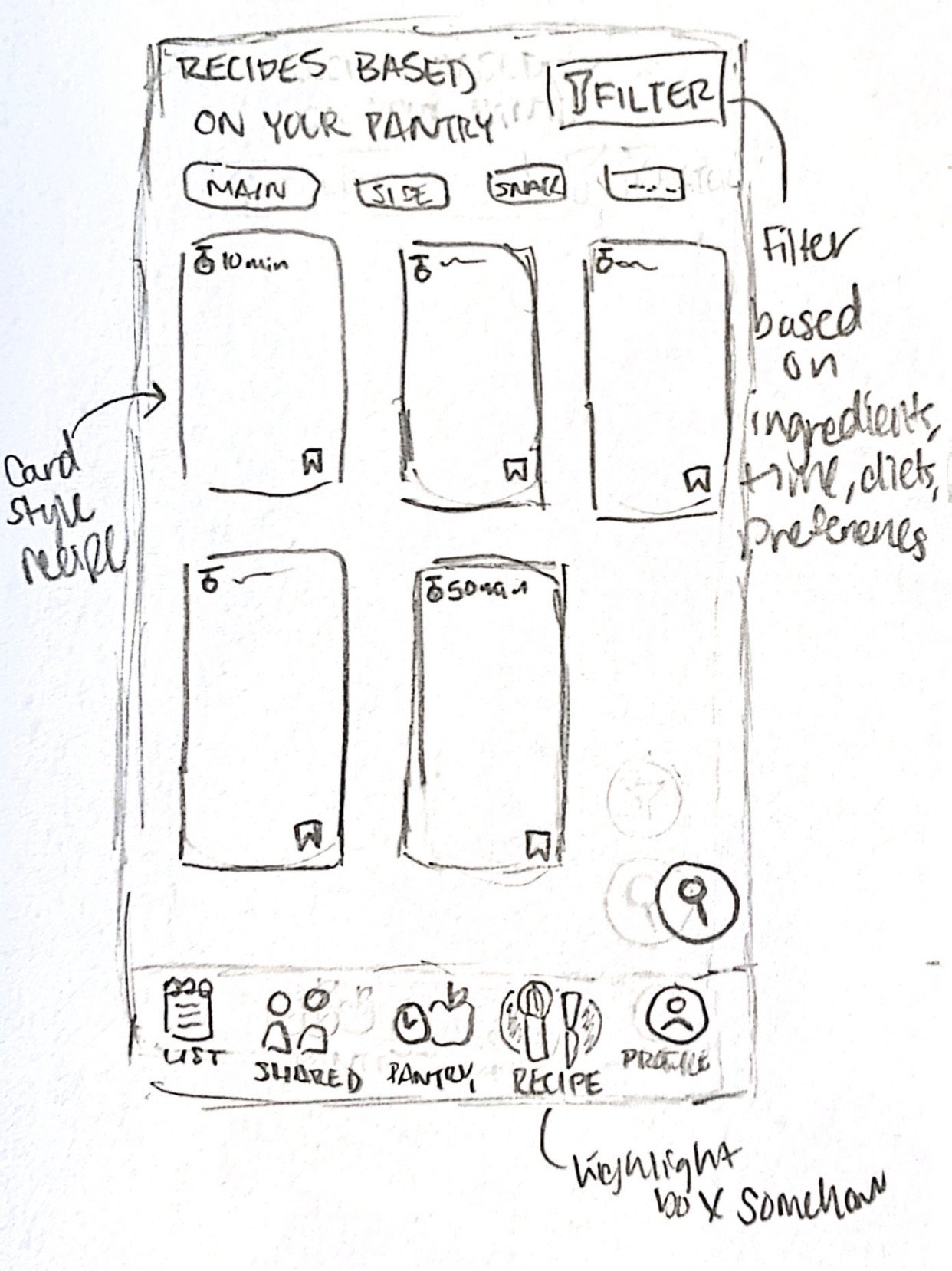
Once we got an understanding of what other apps included and what they lacked, we began the sketching phase of the project (in my opinion the fun part!). These are the sketches I created for each navigation bar option. Starting from the left to the right, I created a pantry, recipe, shared fridge inventory, shopping list, and a profile page. Each of our group members shared their sketches for these aforementioned pages, and we divided up the actual lo-to-high fidelity pages based on which sketches we liked the most and which contained the most fitting components depending on our app’s purpose. I was assigned the pantry feature which notably contains the product’s information (who owns the product, how often it is consumed, the option to add it to a shopping list) and labels to differentiate when each product is estimated to expire.
Lo-Fidelity Wireframes
After two iterations of meeting with my group and refining my lo-fidelity wireframes, I made several changes between my sketches and implementing my pages in Figma. Some of these changes included:
Adding a search inventory & delete from inventory feature
Filtering option for types of food and when they are expiring vs. need to be used by
Who shares the food item (in the cases of family members or roommates)
An individual view for users who live alone and don’t share a fridge with others
Styling Guidelines
I then created a style guideline template in which we chose this color palette to reflect ‘food’ since our app focuses on food waste and management. We wanted the colors to also be welcoming to new users therefore we chose more warm tones that complemented well with accent colors like Olivine Green. Our logo is a fridge to represent our app’s focus on keeping track of foods in fridges.
Hi-Fidelity Wireframes
These are my finalized hi-fidelity wireframes, the main changes I made between lo-to-mid then to high fidelity was adding labels for each food product to make them more readable for users, implementing the color palette from the style guidelines, and reorganizing the layout of some of the buttons (apply filter, reset filter, delete items). I also added colored labels with corresponding ‘E’ and ‘U’ text so users can tell which items are expiring soon versus need to be used by.
Usability Testing
Once the high-fidelity mockups were completed and prototyped, I created a usability testing scenario for a user in our target demographic to try out our app. They were asked to perform a series of tasks for each of the pages I created while I was monitoring their behavior and thoughts on a live Zoom call. While they went through the prototype, I asked that they would vocalize their live thoughts and feelings so I could get an organic understanding of how the user may feel while navigating through our page. After they completed all of the actions, I asked how they felt about their experience with my wireframes and if they had any thoughts they would like to share with me about the product’s interface.
Some of the feedback I received was that the user felt that it was relatively simple and easy to use, the only frustration they had was the size of some of the text which I adjusted accordingly.
Future Improvements & Reflections
Overall I learned a lot from this project as a group member and as an individual designer:
As a team lead, I should spend more time preparing resources for lesser experienced designers and team members so we can all have a similar foothold of knowledge before we begin the project.
Outside of a time constrained course setting, I would also plan to spend more time between low, mid, and hi-fidelity wire framing to refine some details that we didn’t have time to work out (such as additional coupon/discount features).
3D graphics created by @nabeeel.design 🥕

