Find Your Anchor is a grassroots movement, registered in Chicago + Southern California, aimed towards suicide prevention, awareness, and education. This nonprofit organization uses physical blue boxes (anchors) as a platform for communities to stay bonded together.
-
3 Quarters (Roughly 20 weeks)
-
Product Designer
-
Commit the Change
-
Figma, Google Workspace, Notion
The Context:
The Problem:
The Solution:
I joined the Find Your Anchor (FYA) design team in Fall of 2021 with a mission to deliver high quality software for non-profit organizations, as well as gain technical experience working with a talented team of fellow UCI developers and designers. Over the span of 3 quarters, I worked on planning & design development including: user research personas/flows, low-fidelity mockups, prototyping, high-fidelity wireframes, and user testing. While going through this process, I also underwent collaborative sprints with the developer team to ensure that developer abilities and designer guidelines coincide smoothly, as well as met with the NPO for user-experience feedback to achieve their desired product.
With Find Your Anchor increasingly growing in terms of supportive mental health outreach, they struggled with keeping track of their “anchors” which were collaborative blue boxes harboring individual’s sentimental items that helped keep them and others anchored to their community. FYA came to us to solve this problem so admins and users could easily pinpoint boxes on a map (through their desktop or phone) and update information on these anchors as they continue to travel the world and brighten others’ days.
We spent time to truly understand the client’s needs and developed/reviewed our designs every step of the way from low-level sketches to low/mid/high fidelity wireframes. Of course we ensured to keep the audience in mind when designing intuitively to avoid further frustration or unnecessary struggles with certain typography, color schemes, and phrasing. Our designer and developer teams developed an interactive map that held pins in certain cities where boxes were populated. We also created separate admin and user views to match the level of complex functions including the options to add more boxes, delete boxes, change personal information, edit box messages, and etc. Our product was able to address the concerns the NPO had while providing additional relief to box admins and users alike in navigating these anchors.
Project Requirements
FYA Product Requirements
After our design leads solidified our product goals with FYA, we compiled a Product Requirements Document (PRD) on Google Docs to ensure that our design team understood their focuses (Guest and Admin views). As well as address any other details regarding timeline, team logistics, and pertinent features.
FYA Project Requirements Additional Information
The developer team also met separately with the NPO to answer questions that were crafted from both teams which significantly helped in terms of organization and additional technicalities. As a designer I would often refer to this holy grail of a document to review what information was needed to be implemented into my wireframes.
Empathy Maps
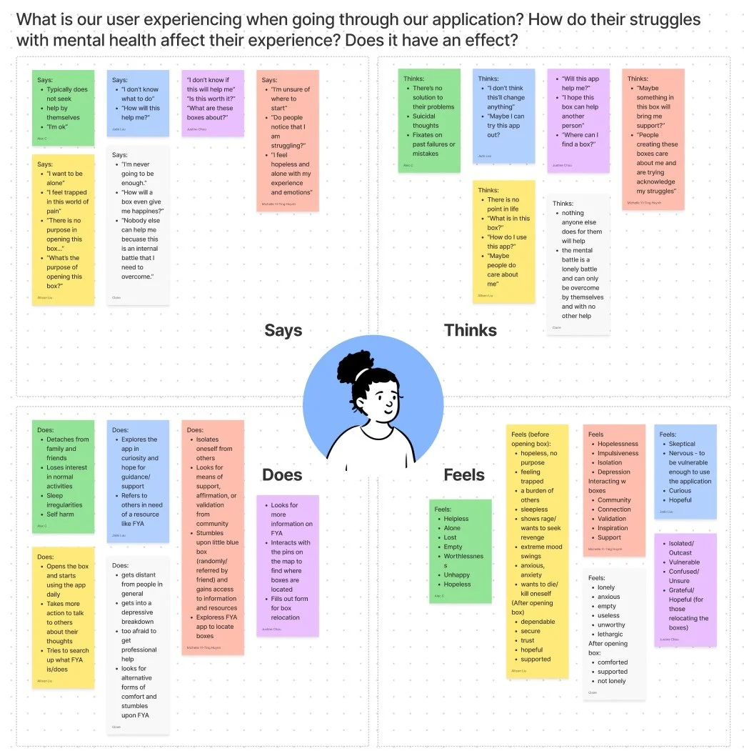
We started our process by creating an empathy map to compile what the user says, does, thinks, and feels to get a larger picture of the user. From this collected data, we can better empathize with them and design accordingly!
User Personas & Flows
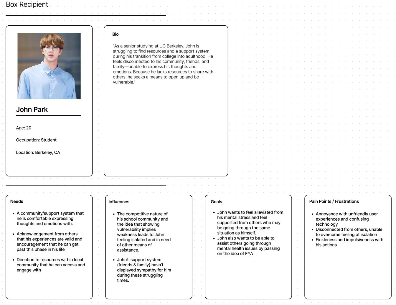
Our team then created three user personas to represent an admin and two general users. I created the general user, John Park, to help myself and my team understand the needs and characteristics of a larger demographic of users who would be the recipients of the boxes.
UX Research
Sketching Flows
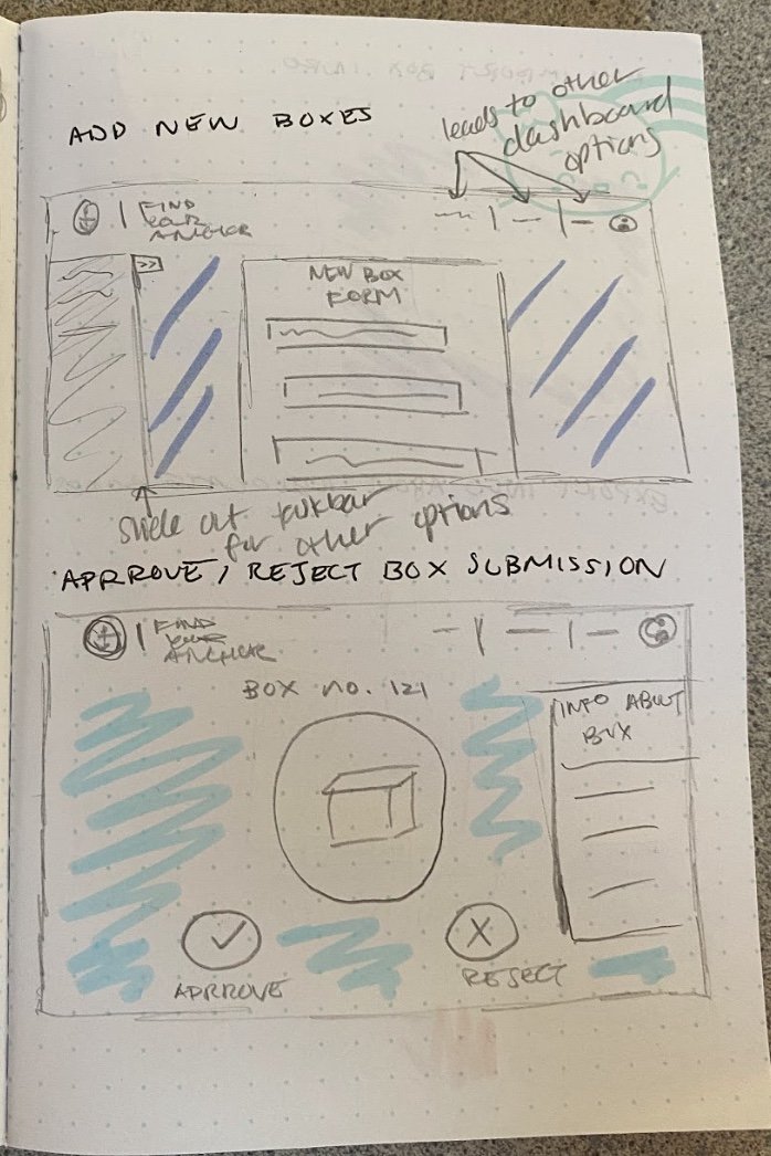
Based on the project requirements document we initially created and the UX research I conducted, I sketched out the plans for both the desktop and mobile view of the site. Since I was assigned to focus on the admin pages of this project, most of the functions I sketched out had to do with the main dashboard which included: mass import box info, adding new boxes, exporting box info, approve/reject box submissions, and removing boxes from the system.
Low-Mid Fidelity Mockups
After the initial sketching process, I discussed my flows with my design team and implemented feedback promptly before I began creating wireframes on Figma. I was also assigned to the specific ‘Upload CSV’ and ‘User Profile’ functions instead of the general navigation bar that was shown in my previous sketches.
This was actually the first time I had began to use Figma so I ran into roadblocks with my designs in terms of balancing negative space on the desktop view as is shown below. However, through this process of transferring paper to digital screen, I was able to sort out design details that I found unnecessary or convoluted. These several revisions + lots of support on our slack channels helped me build a basic foundation for my wireframes.
Style & Branding
These colors and logos are based off of the branding guidelines that Find Your Anchor gave to us in the early stages of design. We kept the same variety of blues consistent with our design to reinforce the organization’s image.
High Fidelity Wireframes
After the color scheme, typography, and icons were solidified, I began to refine my low-mid fidelity wireframes according to feedback from my team. Provided below are the final high fidelity pages I worked on along with pop-ups and their pathways.
Upload CSV
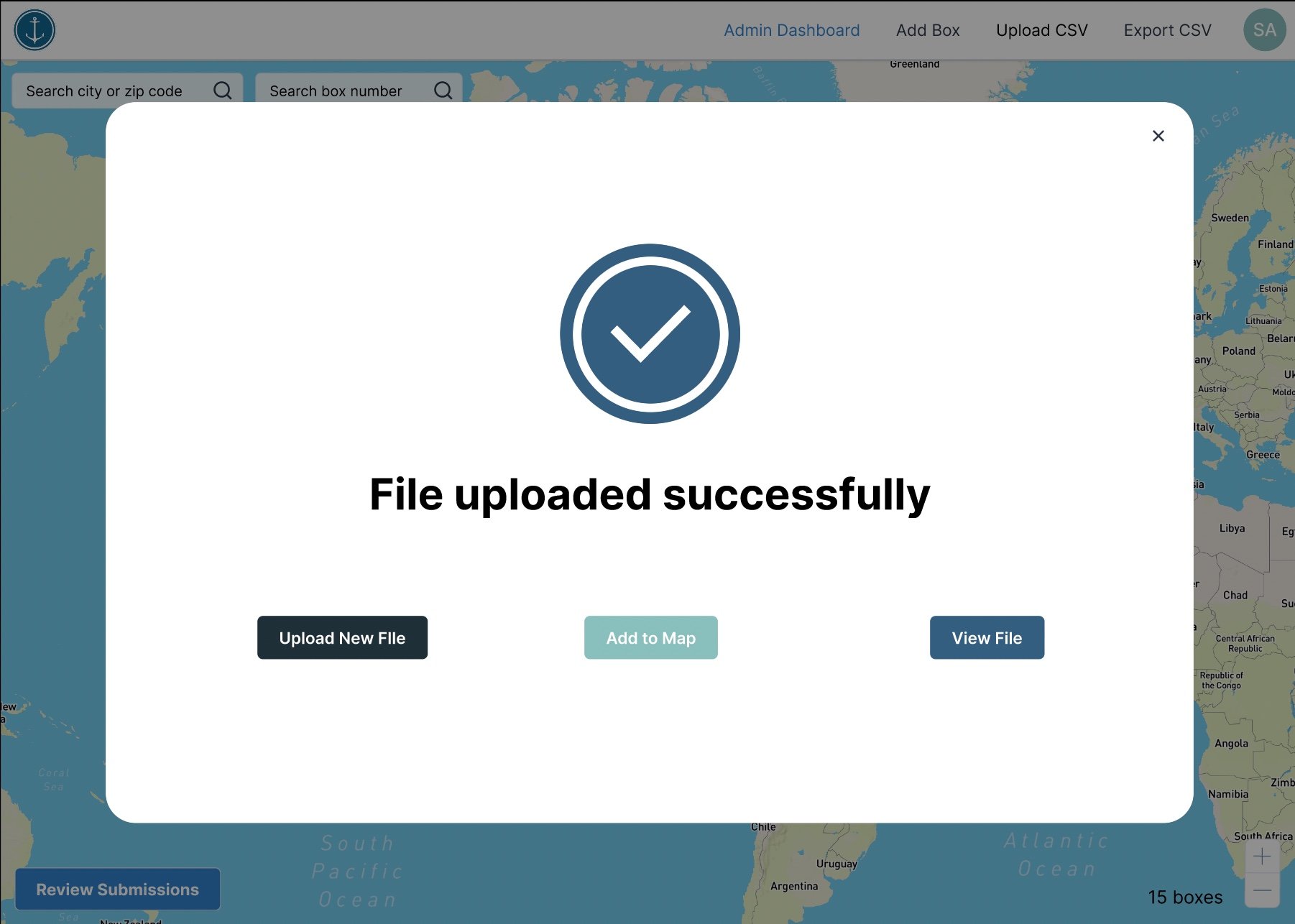
For the Upload CSV page I included several pathways that considered the user's multiple options/scenarios. In the success scenario in which there are no errors with the CSV (pictured first on the right), the user would be taken to the ‘file uploaded successfully’ popup where they can choose to directly navigate to their desired outcome. However, if the user chooses to exit from the popup without choosing any of the buttoned options, the ‘file unattended’ alert (image placed below the success image) will remind the user that they must perform an action once they have a successfully uploaded file.
In the case of the error scenario (pictured last on the right), the user will be met with an alert screen that lists the errors within the CSV as well as the options to view them and edit them after. Of course they can also choose to entirely abandon this file and upload a new one.
This is the immediate popup the user will interact with once selecting ‘Upload CSV’ from the navigation bar. Depending on the file, one of the three outcomes will stem from here (images to the right).
View File Error Pathway: If the user chooses to view their file directly from the error popup, the pathway for the file with errors is shown directly below. Here, the user can detect the exact box (anchor) within the file that has errors (which can be due to repeat box numbers or invalid zip codes), and choose to edit or delete that box.
Once the user chooses to edit the incorrect box, they can hover over the error icon to understand the exact issue in order to edit and update the box to be added to the map. The file cannot be added to the map unless there are 0 errors.
Within the file page there is also a pagination option to view pages of boxes to minimize scrolling for the user.
View File Success Pathway: This pathway follows the user after the file is successfully uploaded with no errors. It demonstrates the same functionality and layout/structure of the error pathway with no errors.
User Profile
For the user profile page, I tried to keep it relatively simple for the admin to view their account. There was very little functionality for this page so I found it difficult to make use of the space properly, but with feedback from my design lead, I was able to create these pages below. From here, the user can choose to edit their first and last name (email address was specifically requested as uneditable by client) which is indicated by the pencil and checkmark icon for editing/saving.
The user can also choose to send a registration link via email through the user profile page. Below shows the process for entering the recipient’s email address and confirmation that the email has been sent.
From the user profile page there is also an option to delete their account (this is limited to admins) which will redirect them to the login/registration page. Or they can choose to sign out which will also redirect them to the login/registration page.
For the mobile view I had chosen to exclude the sign out option on the user profile (in consideration for the smaller interface) and instead I included the logout option in the navigation menu.
Usability Testing
Once the high-fidelity mockups were completed and prototyped, each of the designers created usability testing scenarios for the client to experience the product and give feedback on what they liked and what they thought could be improved upon. They were asked to perform a series of tasks for each of the pages I created (Upload CSV/User profile for desktop/mobile) while we were monitoring on a live Zoom call. While they went through the prototype, we asked that they would vocalize their live thoughts and feelings so we could get an organic understanding of how the user may feel while navigating through our page. After they completed all of the actions, I asked how they felt about their experience with my wireframes and if they had any thoughts they would like to share with me about the product’s interface.
Some of the feedback I received was that the clients felt that it was relatively simple and easy to use, the only frustrations they had were the alignment of the delete account button which I then adjusted to their liking.
Takeaways ✏️
-
Through this project I found communication with my design lead, design team, and developers to be essential in ensuring that our product came together smoothly and efficiently. I definitely did struggle to reach out for help therefore that is a key lesson for me to bring to my next project!
-
I found that the style and branding guidelines were super helpful when it came to designing my mid-high fidelity wireframes however our design team (including me) hadn’t solidified our color scheme, typography, and icons until later in the process of development which made it more difficult to have synchronous designs across pages. In the future, I definitely think getting ahead and solidifying the theme can ease the process of consistency within a design team.


